
Betting resources
TL;DR / Summary.
As a Senior UI Designer at Pinnacle, I led the UI redesign of Betting Resources; a content hub within the Sportsbook product hosting articles, videos, podcasts, and betting tools for users across multiple markets and languages. The redesign aimed to modernise the experience, improve mobile usability, strengthen SEO, introduce personalisation, and better showcase the breadth of multimedia content on offer.
Working in close collaboration with the UX Team, I developed a modular, mobile-first UI built on atomic design principles, ensuring consistency, scalability, and localisation-readiness across more than 200 screens. The visual direction was established through four distinct design themes presented to stakeholders, whose preferred elements were merged into a single, unanimously approved concept (aptly named the "Frankenstein" direction) that became the foundation for the entire redesign.
The project was managed in sprints, with each batch reviewed internally before stakeholder presentation. Significant staff changes during the project's lifespan required me to onboard new team members and help lead the project to completion. Following full stakeholder approval, the redesign entered development and successfully launched. The designs remain live today, demonstrating the longevity and quality of the work delivered.
The Brief.
Betting Resources was Pinnacle's content hub within the Sportsbook, hosting articles, videos, podcasts, and betting tools designed to educate users and support more informed betting decisions. Whilst the product was well established, its usability, navigation, mobile experience, and overall structure needed significant improvement to meet the evolving needs of both returning Sportsbook users and new visitors arriving directly from search engine results.
During the kick-off meeting, business and user requirements were defined across several key areas; improving mobile optimisation and SEO performance, enhancing usability and navigation across content categories, better showcasing the breadth of multimedia content including video, podcasts, and articles, making banner space functional for both content promotion and user acquisition, and introducing personalisation to surface relevant content for individual users. A stakeholder word map exercise revealed the desired creative direction, with "dynamic", "modern", "clean", and "light" emerging as the recurring themes that would underpin the redesign.
Given that many visitors arrive via search engine results rather than through the Sportsbook directly, the redesign had to serve two distinct audiences; returning Sportsbook users whose behaviours were already well understood through existing personas, and new users landing directly on an article with no prior context of the Pinnacle brand. Once objectives were aligned, the project was handed to the UX Team to begin their analysis and establish the foundations for the redesign.
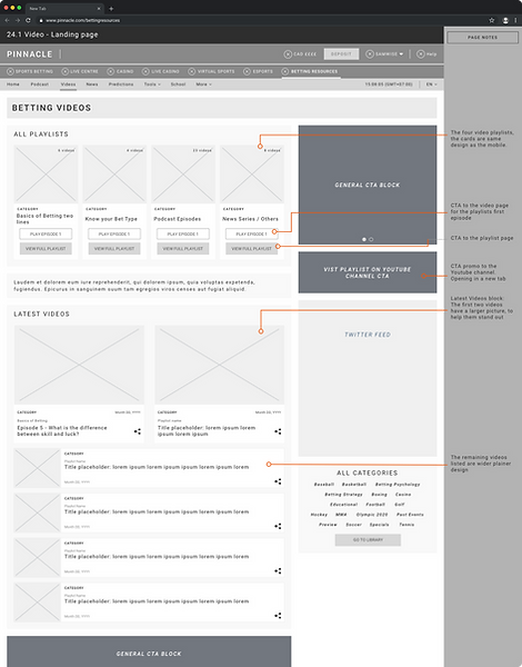
Betting Videos: wireframe

Betting Videos: final UI design
UX Research and Wireframing.
The UX Team conducted competitor analysis, reviewed current usability issues, and examined both quantitative and qualitative data to understand user behaviour and identify pain points within the existing product. Working closely with the team throughout, I contributed to the process by reviewing findings, asking questions, suggesting alternative approaches, and helping to refine testing scenarios; ensuring the UI perspective was considered from the earliest stages of the redesign.
Mobile-first wireframes were produced to ensure structural consistency and scalability across devices, with annotated flows clarifying intended functionality and behaviours. A review session provided an opportunity to collaborate on hierarchy, flow, and layout decisions, with alternative approaches discussed and targeted revisions made where improvements could be identified. Where functionality required further definition, I produced UI prototypes to demonstrate how certain interactions and behaviours would work in practice.
Thorough usability testing with both Pinnacle and non-Pinnacle users would ideally have been conducted at this stage to validate the wireframes and surface any pain points before progressing. Due to time and resource constraints this was not possible, however the team progressed with confidence based on the data gathered, the competitor analysis, and the collaborative review process that had taken place.


UI Design.
I began the UI phase by creating a mood board to define the creative direction and align with the project goals and word map themes established in the brief. Given the dynamic nature of the content and the need to support multiple languages, I explored a wide range of concepts spanning from safe and on-brand to more experimental approaches, with a consistent focus on strong content presentation and visual hierarchy. Building from a mobile-first foundation, I tested gradients, image and content layouts, icon positions, dark-mode accents, and container card patterns. These experiments evolved into four distinct design themes; a wireframe-driven approach, an image-heavy treatment, a neumorphic style, and a minimal open layout, each presented to stakeholders in both mobile and desktop resolutions. Rather than selecting a single theme outright, stakeholders identified their preferred elements from each, which were then merged into a single, unanimously approved concept aptly named the "Frankenstein" direction, that became the visual and structural foundation for the entire redesign.


The component library I developed followed an atomic approach; singular design elements acting as atoms, combined to form molecules such as container cards, which in turn formed organisms at the page section level. This modular methodology ensured consistency and reusability across the interface, and provided the flexibility needed to serve the breadth of content types across the repository. Container cards were carefully crafted to remain visually coherent regardless of how much content populated them, with sufficient space built in for languages that are naturally longer in length. Special card types were developed to meet specific project requirements; the Predictions card surfaced live betting data and odds across different sports, providing users with the opportunity to place a bet at any point throughout their journey, whilst the Spotlight feature allowed members to personalise their content experience by selecting categories of interest and being shown relevant articles and media. Accessibility was considered throughout; colour contrast was validated against web standards, font sizes were confirmed as legible across desktop and mobile resolutions, and visual and information hierarchy was carefully considered across every page to guide users clearly through the interface.


The project was managed in sprints aligned to the different sections of Betting Resources, with my input helping to define feasible deliverables within each sprint. Each batch of designs was presented to the internal design teams for collaborative feedback before being shared with the wider stakeholder audience, ensuring issues were identified and resolved early. Approved designs were uploaded to Invision for stakeholders to review and raise any further questions. When delays occurred, I kept management and stakeholders informed with revised timelines and clear plans of action.
The project experienced significant staff changes during its lifespan. As a result, the responsibility of onboarding new team members fell to me; providing explanations and insights into how the intended functionalities and behaviours worked across the full breadth of Betting Resources. Given the scale of the project, I broke the onboarding down into digestible sections covering both high-level concepts and granular design decisions, ensuring continuity and momentum were maintained throughout.
Development.
Following final UI approval, I set up a handover meeting with the Development Team to walk them through the modular approach that had been taken. A high-level overview of the component library was presented as a starting point, covering the atomic elements and container card structures to give the team a clear understanding of how the system had been built and how it should be implemented. Interaction behaviours were documented and handed over in full, covering hover states, dropdown menus, content filters, mobile gestures, notifications, and predictive search. Micro-animation prototypes were also produced for key features including carousels, data charts in the Predictions section, and article interactions. All icons and assets were prepared, exported, and delivered alongside the designs.
As development progressed, I continued to support the team by answering questions, providing clarification on interaction behaviours, and supplying any additional assets required. Where possible, I conducted UI reviews to ensure alignment between the designs and the developed product was maintained, with any amendments identified communicated to the developers for implementation. I collaborated with the Content Team on localisation requirements, and the standardised image dimensions established through the modular approach were communicated to the Graphic Design Team, reducing their workload by allowing the same dimensions to be applied across different container card types. Weekly meetings were held to track progress, surface bugs, and prioritise development tasks.

Betting Resources - home: screenshot of live site as of 2026

Betting Resources - videos: screenshot of live site as of 2026
Post-Launch Performance.
Following the development phase, Betting Resources launched successfully and was well received. Having left Pinnacle around the time of the launch, post-launch performance metrics were not directly available to me, however the fact that the designs have remained in use for several years is a strong indicator of their quality, longevity, and continued relevance to Pinnacle's users.
Had I been able to carry out a thorough post-launch review, the next phase would have focused on:
-
Reviewing analytics and user feedback to understand engagement patterns, identify pain points, and assess how effectively the personalisation and content discovery features were being used
-
Conducting A/B testing to validate design decisions and measure the impact of the redesign on key metrics including navigation, content consumption, and user retention
-
Collaborating with the Analytics Team to monitor evolving user needs and feed insights back into an iterative improvement cycle
The project remains one of the most ambitious and complex UI undertakings of my career at Pinnacle. Over 200 screens delivered across a fully modular, accessible, and localisation-ready system that continues to serve Pinnacle's users today.