Pinnacle Sportsbook
TL;DR / Summary.
The Sportsbook was my primary product responsibility across my tenure at Pinnacle, during which I progressed from Mid-weight to Senior UI Designer. A high-traffic betting platform attracting tens of thousands of daily visits across multiple countries, languages, and regulatory environments, the Sportsbook required sustained, senior-level UI design delivery across a continuous improvement programme.
Design work spanned the full redesign of the Sportsbook across desktop and mobile in both light and dark modes, alongside the introduction of significant new features including the Live Centre, Horse Racing, My Account, Scoreboards for live and upcoming events across multiple sports, Quick Bet functionality, Bet Highlight cards, Game Lines, Bet Slip, and Matchup and League pages. Working closely with the UX, Content, and Development teams, I translated wireframes and user flows into polished, accessible, and technically feasible UI designs. My duties also included stakeholder management; presenting designs, managing expectations and timelines, communicating progress, and organising review sessions with them and various teams throughout the project's lifecycle. The designs produced during this period remain live today, a testament to their longevity.
To support the scale and complexity of the product, I championed the migration from Sketch to Figma, modernising the team's design tooling and workflow. In Figma, I built a comprehensive component library comprising reusable colour palettes, icons, game lines, odds states, headers, and CTAs, enabling consistent and efficient delivery across the many features and teams involved. Beyond the core Sportsbook, I collaborated with the UX Team to design a conceptual wagering journey for a proposed Pinnacle mobile app, which received stakeholder approval before the project was unfortunately discontinued during development, though it provided valuable app design experience nonetheless.
The Brief.
Pinnacle's Sportsbook is one of the company's most prominent products, attracting tens of thousands of daily visits across multiple countries and markets. I joined during the early stages of a major redesign aimed at making the interface more engaging and user-centric, and continued to contribute across the product's ongoing improvement programme throughout my tenure.
Design briefs varied considerably in scope and complexity; some required extensive cross-team collaboration, stakeholder management, and lengthy review cycles, whilst others demanded quick, focused turnarounds. All required desktop and mobile designs across both light and dark modes. The international nature of the product added a significant layer of complexity; with users across many different countries, each subject to their own rules, regulations, and behaviours, every design decision had to be considered holistically and with flexibility in mind.

Pinnacle.com: Home page prior to redesign

Pinnacle.com: About page prior to redesign
UX Research and Wireframing.
Close collaboration across the UX, Content, and Development teams was central to every design task, with each project beginning with a thorough UX handover before UI work commenced. Competitor analysis was conducted to understand how other companies approached certain flows and functionalities, identifying what worked well and where pain points commonly occurred. User personas and available qualitative and quantitative data helped guide design decisions and provided insight into user preferences and behaviours.
Wireframes and user flows were presented and reviewed collaboratively, typically followed by a Q&A session. I was always genuinely interested in the approaches and decisions taken by the UX Team, and where I could contribute, I offered alternative ideas and solutions to help create a more useful and usable product.
Whilst the UX Team consistently advocated for greater investment in usability testing, time and resource constraints often limited its inclusion. A more comprehensive approach combining ethnographic field research, focus groups, surveys, and one-to-one interviews would have deepened the understanding of user needs and strengthened the foundations upon which design decisions were made.

Wireframe: My Account

Wireframe: Horse Racing

Wireframe: Live Centre

Wireframe: Scoreboards
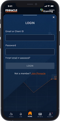
UI Design.
For each design task, I worked within the established branding principles and design aesthetic, often exploring alternative concepts alongside the primary solution to push brand development and improve usability. Effective redesigns stemmed from a clear understanding of what was and wasn't working on the existing site, combined with an awareness of how user needs had evolved since the previous iteration. Clear affordances, consistent signifiers, and strong feedback systems were essential throughout, ensuring the interface remained engaging, intuitive, accessible, and on-brand.

Home page: surfacing Quick Bet functionality - Light Mode

Home page: surfacing Quick Bet functionality - Dark Mode
In Figma, I built a comprehensive atomic style guide informed by Brad Frost's atomic design methodology, breaking the interface down into its constituent parts. The style guide covered a range of reusable design attributes including colours, typography, spacing, and sizes. At the atomic level, this included icons, game lines, odds states, headers, buttons, tabs, checkboxes, and radio buttons, amongst others. At the molecule level, elements such as fields, odds, filters, messaging, cards, and tiles were defined. At the organism level, more complex components were covered including game lines, forms, and features such as Scoreboards. All components were designed with their associated interaction states included, enabling consistent, scalable, and efficient delivery across the many features and teams involved.
The complexity of the Sportsbook presented a unique design challenge. With large volumes of varied data displayed across many languages, every pixel counted; the UI had to be flexible, space-efficient, and simple enough for users to complete their intended tasks with ease, whilst functioning seamlessly across light and dark modes and in mobile, tablet, and desktop screen sizes. Designing for a global audience across multiple regulatory environments meant that no assumption could be made about how content would behave, making a disciplined and systematic approach to layout and hierarchy essential.
Once UI concepts were ready, I presented them to the relevant internal teams for review and collaborative refinement. Following feedback and any necessary amendments, a final presentation was held with stakeholders and relevant external teams for sign-off before the designs progressed into development.


Soccer odds page: showcasing highlighted matches


Matchup page: showcasing the scoreboard and relevant odds


My Account page: preferences


Live Centre: surfacing four different sports


Horse Racing: showcasing sport-specific layouts
Development.
At the point of handover, all assets, finalised designs, and the atomic style guide were supplied to the Development Team, giving developers a clear and comprehensive reference for consistent implementation across the product.
Prototyping and micro-animations were produced, where needed, to clarify intended interaction behaviours, demonstrating how components should respond to user input and giving developers a precise reference for how functionality should behave. Developers also used the handover stage to ask questions and flag any constraints within the platform, and a flexible, collaborative approach was maintained throughout the build to ensure both UX and UI requirements were properly upheld.
Where possible, I conducted front-end reviews upon completion of the build, cross-referencing the developed product against the signed-off designs and communicating any discrepancies to the Development Team for resolution, ensuring what appeared on screen accurately matched the approved UI.


Atomic Style Guide
Adding favourites micro-animation
Scoreboard goal change micro-animation
Navigating to more markets micro-animation
Game line goal change micro-animation
Post-Launch Performance.
Following each feature launch, I worked closely with the Analytics and UX Teams to assess KPIs, user feedback, heat maps, and recorded user sessions, identifying areas for improvement and informing future design decisions. This iterative cycle of launch, review, and refinement was applied consistently across the full breadth of features delivered during my tenure, from the Live Centre and Horse Racing through to Scoreboards, My Account, and beyond.
Whilst more frequent and in-depth data analysis would have strengthened the decision-making process further, the insights gathered were used to drive user-centred improvements that enhanced usability, clarity, and overall satisfaction across the product. The designs produced throughout this period remain live today, a testament to the longevity and considered approach taken across every feature and update delivered.
Pinnacle App.
Towards the end of my tenure at Pinnacle, senior stakeholders commissioned a native mobile app to extend the Pinnacle product suite, specifically targeting the Canadian market. The UX Team undertook the same rigorous process as the Sportsbook; competitor analysis, user personas, user journey mapping, and qualitative and quantitative analysis, before producing wireframes that were reviewed collaboratively by myself and the wider UI Team through Q&A sessions and the exploration of alternative approaches.
From there I began ideating on a range of visual concepts, with the design featured in the imagery selected as the direction to take forward. The UI introduced colour-coded market types, i.e. green for live events, to help users instantly identify and navigate to relevant content. Mobile gestures were central to the experience; swiping up on a featured matchup revealed associated odds and information, whilst swiping left or right navigated between other events in the same category. Selecting an odd surfaced the Bet Slip as a bottom sheet component, keeping the user within context whilst completing the purchase journey.
Given the constraints of smaller screens, maximising the available screen real estate was a key consideration throughout; tabs, horizontal scrolling menus, and dropdown components were used to keep the interface clean and navigable. Login and Join journeys were handled via bottom sheet components, maintaining a consistent feel across the app. Notifications were designed to integrate with the user's operating system, and a loading screen was created utilising Pinnacle's logo underline as the loading bar, a small but considered detail that resonated strongly with the stakeholders.
The app received full stakeholder approval and progressed into development. Having left Pinnacle at that point, I was later informed that the project was unfortunately discontinued, though it provided valuable app design experience and represented an exciting extension of the Pinnacle brand into a new product category.