PokerStars Exclusively on FanDuel
TL;DR / Summary.
PokerStars, Exclusively on FanDuel is the product of 'Project River'; a strategically significant initiative bringing the globally recognised PokerStars poker brand onto the FanDuel platform for the first time, launching to players across three US states and Ontario, Canada.
My role evolved from design reviewer and consultant to Lead UI Designer, taking end-to-end ownership of UI delivery across a fully co-branded mobile app and aligned desktop client. Working in parallel with my leadership of the Fusion Design System, I created the PokerStars theme within FanDuel's Design System, designed across multiple user journeys and touch-points, supported UX testing, conducted UI reviews, and collaborated closely with teams across both organisations to deliver a consistent, accessible, and scalable co-branded experience.
The product launched on 1st April 2026 on both iOS and Android. Early indicators are promising; the app recorded over 10,000 downloads on Google Play, with opening day tournament participation exceeding 2,000 entries across nearly a dozen events. A standout $5 Daily Draw attracted 611 entries on Day 1, with nearly 3,000 players returning to compete on Day 2. Within the first five days of launch, the product generated over $500k in revenue, a compelling signal for the product's commercial trajectory as the rollout continues.
The Brief.
As part of the PokerStars Network initiative, enabling partner companies to host the PokerStars poker product on their own platforms, I was asked to join a new programme alongside my leadership role on the Fusion Design System. This initiative brought the globally recognised PokerStars brand onto the FanDuel platform and internally became known as 'Project River'.
In the early stages, my involvement focused on design review and consultation. I reviewed initial design concepts produced by the PokerStars Brand Team, which outlined the strategic intent, brand relationship, and integration goals of the co-branded experience.
As the project progressed, my role evolved into Lead UI Designer. Using Fusion as a central point of reference, I ensured strong alignment with PokerStars' brand throughout, maintaining integrity through the considered application of design attributes, component usage, patterns, and information hierarchy. I became responsible for producing UI designs across both ideation and final concepts, managing the delivery of the UI, communicating progress, identifying risks and refinements, delegating work, and fostering close collaboration across teams. The deliverable was a suite of designs spanning multiple user journeys and touch-points across two platforms; a co-branded mobile app and an aligned desktop poker client, targeting an initial soft launch across three US states and Ontario, Canada.

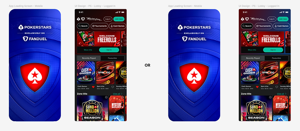
Theming the FanDuel Casino app to create the PokerStars, Exclusively on FanDuel experience
Mobile App Strategy.
The mobile strategy centred on duplicating FanDuel's successful Casino app framework and applying the PokerStars Dark Mode theme in accordance with Fusion. Designs utilising the Light Mode theme were also produced but scheduled for post-launch release.
The app's structure, hierarchy, component usage, and behaviour remained consistent with FanDuel's Casino experience, while PokerStars branding was layered on as a reskin across key aspects of the app and user journeys, including MarTech, Promotions and Rewards, CPE, landing pages, and pre-game screens. When users launched a game, the third-party poker software surfaced, delivering a fully PokerStars-branded in-game experience with familiar games and rewards. Utility journeys including sign-up, onboarding, deposits, and account management remained FanDuel-branded, reflecting account ownership for FanDuel's primary user base, with PokerStars users given the option to create FanDuel accounts to access the product.
Loading screens, landing pages, headers, modals, and logo lockups adopted a co-branded visual language, combining PokerStars' spade and FanDuel's shield alongside shared brand imagery and colours - red for PokerStars, blue for FanDuel. Modals incorporated short-form logo lockups to further reinforce the brand partnership.

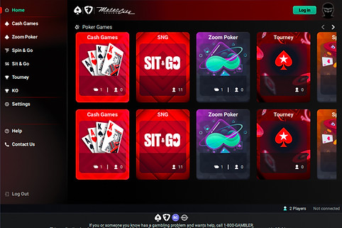
Mobile 'lobby' page: PokerStars dark & light mode, FanDuel Casino ref.

Desktop 'lobby' page: Dark mode and subsequent co-branded gradient
Desktop client: staging environment

Third-party vendor: in-game experience for PokerStars, FanDuel ref.
Building the PokerStars Theme in Formation.
A key early design responsibility was creating the PokerStars theme within FanDuel's Design System, Formation. Drawing on my experience creating themes within Fusion, I collaborated closely with Formation's Senior Product Designer and Product Design Senior Manager to understand the system holistically; its structure, processes, and the design elements that could and could not be modified. This was essential for managing expectations clearly with stakeholders and project leaders on the PokerStars side, ensuring the scope and constraints of the theming work were well understood from the outset. This cross-organisational collaboration also provided a valuable opportunity to observe Formation's more mature processes and practices first-hand, informing my own thinking around Fusion's continued development.
Working within those parameters, I defined the theme's extensive colour palette, system and component interaction states, and design attributes across both Light and Dark Modes. These were applied across a wide range of components including buttons, inputs, controls, cards, messaging, and tabs, all while ensuring accessibility standards were met, particularly important given the highly contrasting PokerStars red and FanDuel blue used throughout the UI designs.

PokerStars theme: colours

PokerStars theme: typography, background and borders
Cross-System Component Integration.
The PokerStars theme was integrated into Formation and applied to duplicated versions of two key FanDuel libraries: the Core and Casino component libraries. The Core library, maintained by the Formation team, served as the foundational system for FanDuel products, allowing me to apply the PokerStars theme to baseline components for consistent use across the app. The Casino library, built on the Core library, was similarly themed and reused, ensuring full alignment with the structure of the duplicated Casino app while preserving FanDuel's established component architecture.
FanDuel's iconography and typography libraries were also linked alongside PokerStars' assets and type styles, providing flexibility where brand differentiation was required.
Working across two design systems simultaneously required a deliberate and disciplined approach; context-switching effectively between Formation's established architecture and Fusion's evolving foundations, prioritising work thoughtfully, and communicating clearly across both organisations to ensure neither system nor project suffered as a result.

Theme application: core library - button component

Theme application: core library - inline message component

Theme application: core library - input field component

Theme application: casino library - header component
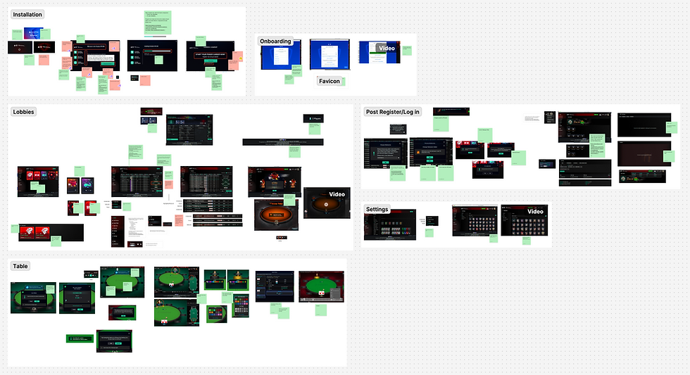
UI Design Delivery.
With themes and libraries in place, I linked everything into a shared Figma Connected Project accessible to both organisations. Based on requirements from multiple Product Owners, I structured the file accordingly and produced UI designs in both Light and Dark Modes across four key areas:
Casino App: Core app experience designed end-to-end, covering launch and loading screens, lobby and category pages, co-branded gradients, headers, footers, navigation, modals, game previews, and jurisdiction-specific logo lockups.
MarTech: Promotions and Rewards journeys designed in full, including promotion details pages, carousel components, Tournament Ticket and Rake-back bonuses, and their associated interaction states, error handling, tooltip behaviours, and responsive layouts across desktop and mobile.
Customer Portal Experience (CPE): Header entry points for guest and member states, sign-up and deposit journeys distinguishing between the PokerStars gaming environment and FanDuel account utilities, and login pages demonstrating correct co-branded visual treatments across desktop and mobile.
Landing Page: Reviewed the initial iteration, produced revised wireframes to better define the page structure and content strategy, and applied final UI designs using themed co-branded components and imagery, including a QR code for desktop users and responsible gaming resources throughout.
Throughout development, I conducted regular UI reviews to evaluate implemented designs, feeding back to Product Owners and collaborating with FanDuel's development teams to ensure accessibility standards, visual consistency, and brand alignment were upheld, preserving overall brand integrity.

Promotions page

Tournament Tickets, Rake-back bonuses and system, modal messages

Categories page

Pre-game pages

CPE: landing page, registration, deposit, lobby and account pages

Landing Page: wireframes and UI (desktop & mobile)
UX Testing.
By duplicating FanDuel's Casino app, we were able to build on an already well-tested UX framework, including validated user journeys and usability testing on their components. This allowed me to confidently apply the PokerStars theme, supported by the extensive accessibility work already completed within the Fusion Design System. Accessibility checks were nonetheless carried out on all themed components and UI designs to confirm standards were met.
After the UI designs were complete, additional user journeys were tested to assess how seamlessly the FanDuel and PokerStars environments worked together as a single co-branded experience; specifically the FanDuel wallet, onboarding, and account journeys alongside the PokerStars lobby, promotions, and gameplay. I collaborated closely with the UX designers throughout the prototyping and testing process, contributing to the definition of test objectives and reviewing findings as they emerged. Initial results confirmed that journeys were well understood with no major usability issues, but highlighted that transitions between FanDuel's blue theme and PokerStars' red-and-black theme felt visually abrupt.
To address this, I explored alternative header gradients using theme variables and presented recommendations directly to the Brand Director. A darker red-blue gradient was preferred, as it reduced visual friction and better reinforced the co-branded experience. Testing validated the decision; confirming smoother onboarding and deposit flows, clearer attribution of account ownership to FanDuel, and a stronger perceived connection between the two brands, whilst also establishing that logos and messaging remained key cues for brand recognition.
UX testing: Determining the best gradient approach for a single, co-branded experience

UX testing: Facilitating the creation of the testing prototypes

UX test results: red-blue gradient was better understood amongst users
Desktop Client.
Alongside the mobile app, a desktop poker client was required to complete the full product experience. While the underlying technology was provided by a third-party vendor, the design direction, PokerStars theme application, and brand integrity across the customer-facing interface remained under PokerStars' oversight, with the objective of achieving full design parity with the mobile app.
My role focused on review and consultation. I worked closely with the Poker Team to ensure alignment between the desktop client and mobile app, maintaining consistency across UI, assets, imagery, colours including the red-blue gradient, typography, icons, components, and interaction states. I conducted UI reviews, advised on implementation constraints from the third-party platform, and communicated any mobile design updates that impacted the client.
This collaboration culminated in an all-day workshop where I tested the client in a staging environment alongside senior stakeholders from PokerStars and FanDuel, validating requirements, identifying remaining design and branding gaps, confirming user journeys, and aligning on final decisions and handover milestones ahead of launch.
Workshop: Evaluating the various screens and journeys within the desktop client
Launch and Impact.
PokerStars, Exclusively on FanDuel launched on 1st April 2026 on both iOS and Android, across three US states and Ontario, Canada. The launch marked the culmination of extensive cross-team collaboration, rigorous UI delivery, and a shared commitment to quality and brand integrity across both organisations.
Early indicators point to strong initial engagement from the poker community. The app recorded over 10,000 downloads on Google Play, with opening day tournament participation exceeding 2,000 entries across nearly a dozen events. A standout $5 Daily Draw attracted 611 entries on Day 1, with nearly 3,000 players returning to compete on Day 2. Within the first five days of launch, the product generated over $500k in revenue, a compelling signal for the product's commercial trajectory as the rollout continues.
The project represented a landmark moment for the PokerStars Network initiative, demonstrating that a complex, co-branded experience could be designed, tested, and delivered to a high standard across two major platforms and organisations. For me personally, it was a privilege to lead the UI design of a product now in the hands of poker players across North America.